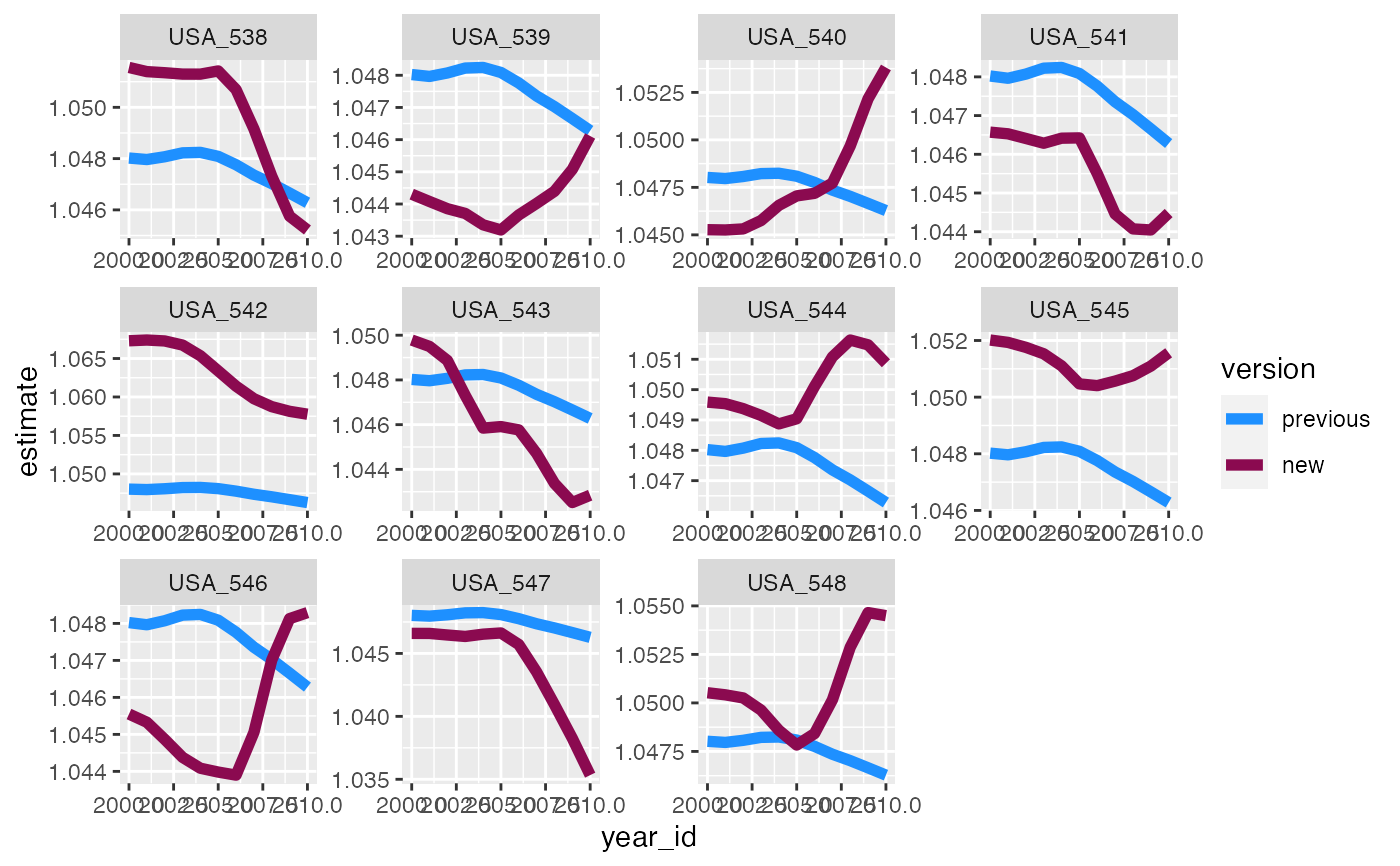
This function can be used to visualize the results of the rank_change function, or to otherwise compare values from two different model versions or sets of estimates. This can help streamline the vetting process. All characteristics for each estimate should be matched, e.g. year, location, age. plot_trends creates plots of the estimates over some unit of time comparing the two sets of results. This could be used for time trends across years, or age patterns. The options for faceting or coloring allow the user to customize the plot to maximize utility. This function assumes that the two sets of estimates are in two different columns, e.g. old_mean and new_mean, and uses pivot_longer from tidyr to reshape the data long to make plotting more straightforward and flexible.
plot_trends(
  data,
  time_var,
  y1_var,
  y2_var,
  facet_x = NULL,
  facet_y = NULL,
  title = NULL,
  facet_type = "none",
  colors = c("dodgerblue", "deeppink4"),
  my_labs = c(y1_var, y2_var),
  line_size = 1
)
Arguments
| data | data.table or data.frame. Data to plot comparing two sets of estimates, e.g. output of rank_change function. Required! |
|---|---|
| time_var |
|
| y1_var |
|
| y2_var |
|
| facet_x |
|
| facet_y |
|
| title |
|
| facet_type |
|
| colors | Vector. This vector would contain the name of two colors to be used in the plot to differentiate the two versions or sets of values. This defaults to dodgerblue and deeppink4, but can be otherwise specified by the user. |
| my_labs | Vector. This vector would contain the labels/names you want to use for the two different sets of estimates. If left blank this will default to the column names for y1_var and y2_var. |
| line_size |
|
Value
A ggplot object.
Examples
plot_trends(trend_changes_USA,
            time_var = "year_id",
            y1_var = "old_mean",
            y2_var = "new_mean",
            facet_x = "ihme_loc_id",
            my_labs = c("previous","new"),
            facet_type = "wrap",
            line_size = 2)